Wright Round
by Sophie Pretorius
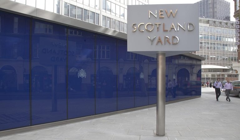
The rotating sign for New Scotland Yard is an astounding feat of engineering; the balancing of 700 kilos of metal rotating 24/7 on a single ball bearing a metre and a half off the ground, on a relatively thin pole, presented quite a challenge. Originally located on the Victoria Embankment, both the sign, and its font, were designed by Edward Wright. Installed in 1968, the sign was once purportedly the second most photographed tourist attraction in London after Buckingham palace. It was moved from 10 Broadway to the Curtis Green Building in 2016, less than half a mile away, where it was equipped with new lights and the addition of the metropolitan police logo. This move cost the British public £68 000, that number causing minor outrage, but its history is more interesting than it may appear at first.
In its new location, it seems to attract less attention, but it still rotates around the clock (the letters now also light up) and perpetuates the slightly sinister message of the police’s constant vigilance.
The designer, Edward Wright, was born to the vice-consul of Ecuador and a Chilean mother in Liverpool, 1912. He was a member of the avant-garde conglomerate, the Independent Group: whose other, and much better-know members, include Edwardo Paolozzi, Nigel Henderson, and Richard Hamilton. He designed the typeface used on the poster for the epoch defining ‘This is Tomorrow’ exhibition in 1956, at the Whitechapel Art Gallery, and took part in the many captivating concrete poetry shows that occurred in the mid ‘60s, in which typeface was being considered seriously for the first time as an expressive medium. Wright’s teaching work at the Central School and the Chelsea School of Art gave rise to the first generation of fully profession graphic designers in Britain, and he is still, among typeface enthusiasts, much admired. However, when his colleagues and friends in the Independent Group began their North American obsessive period, and struck the first long snarky chords of Pop Art, which became their focus, Wright’s modernism turned in a less tongue in cheek direction, and took Southern, rather than Northern America as its model. It is perhaps for this reason that he is less well remembered.
The font he used for the rotating sign, which Wright named Flaxman (using the prefix FLA, which was the Chelsea School of Art’s dialling code) was created for the Concrete Poetry Exhibition, Brighton Festival 1967. Its clarity, legibility and resistance to looking dated, has garnered it praise. It was, and continues to be, used on the internal signage in New Scotland Yard.
It has been suggested that Wright was no great fan of the police, and though he reliably and dutifully completed the sign to brief, it has a rather cyber-fascistic sensibility to it. It seems to me, to bear the architectural features of future intergalactic empires, which filled the world with contemporaneous science fiction books; a comment on the ambiguities of privacy and protection.

